Cute logo for Chubby Cheeks Mochis

0
Creati su 99designs di Vista
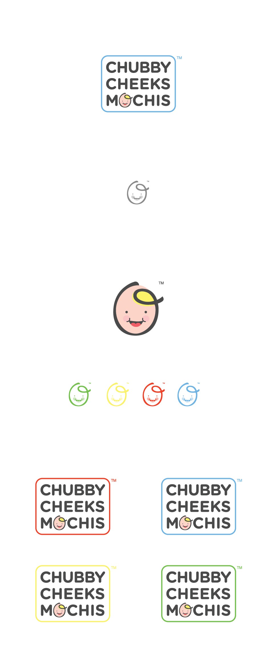
They call their product Chubby Cheeks because you just want to squeeze them like a baby´s cheek. They have the inspiration from their son (they provide a picture). The client initial idea was to have his face as a caricature in the logo.
I decided to go with a simple logo still playful. I reduced the face of the kid as a simple icon and use it as the o of mochis.