Playful logo for oksusu restaurant - winning design

28
Creati su 99designs di Vista
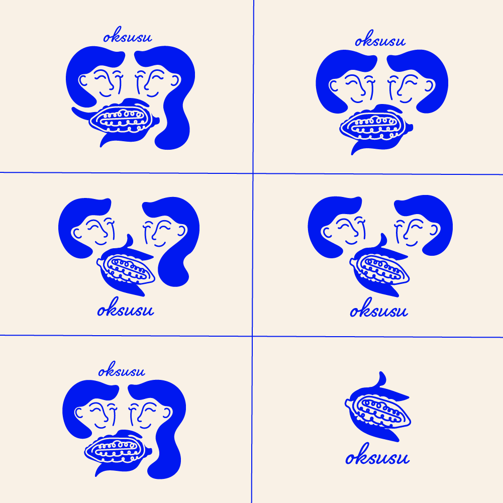
This design was the final iteration of the logo for Oksusu restaurant.
The client wanted to reference the theme of dining together, so I made sure to incorporate an illustration that reflected that sense of communal dining and togetherness. It was also requested that this logo was organic, feminine, youthful and modern. I accomplished this by using organic shapes, curving lines and a soft script font, while maintaining a color palette that is vibrant and punchy. Upon feedback from the client, I adjusted the logo to include corn, which is the english translation of the Korean word "Oksusu" in addition to creating more gender-neutral and friendly characters that imply an invitation and welcome for all.