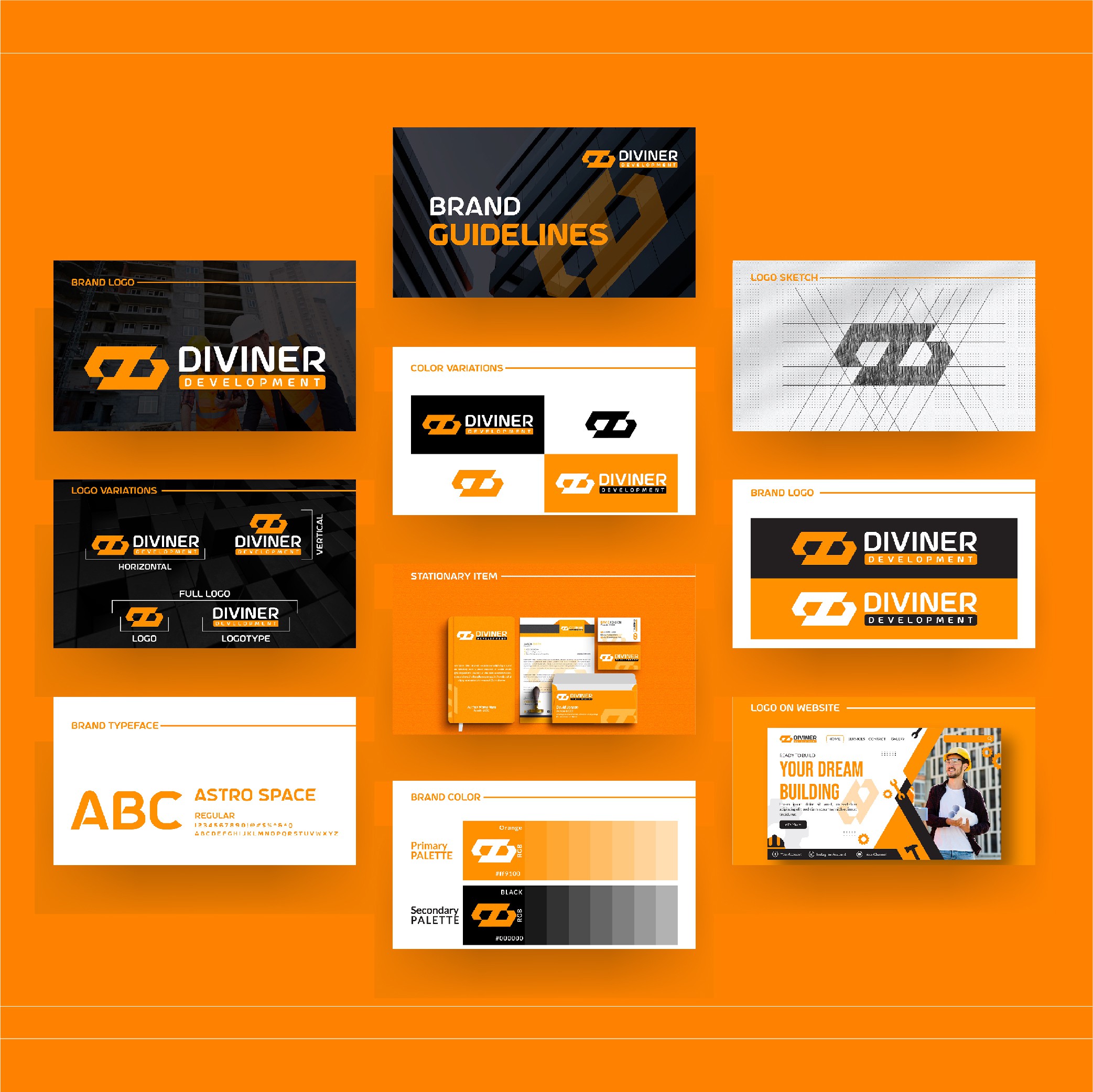

✅Meaning:
The logo represents strength, reliability, and growth, reflecting the core values of a construction company. The bold, geometric design conveys stability, while the orange accents symbolize energy, innovation, and progress in the construction industry.
✅Design Process:
After understanding the client’s vision, I explored construction-related symbols like building structures and strong, angular shapes. I incorporated clean, bold typography to evoke trust and professionalism. Mockups for business cards, construction site signage, and uniforms were created to ensure the design’s adaptability across different applications.
✅Result:
The final logo is modern and impactful, effectively establishing Diviner Development as a leader in the construction industry while appealing to both commercial and residential clients.