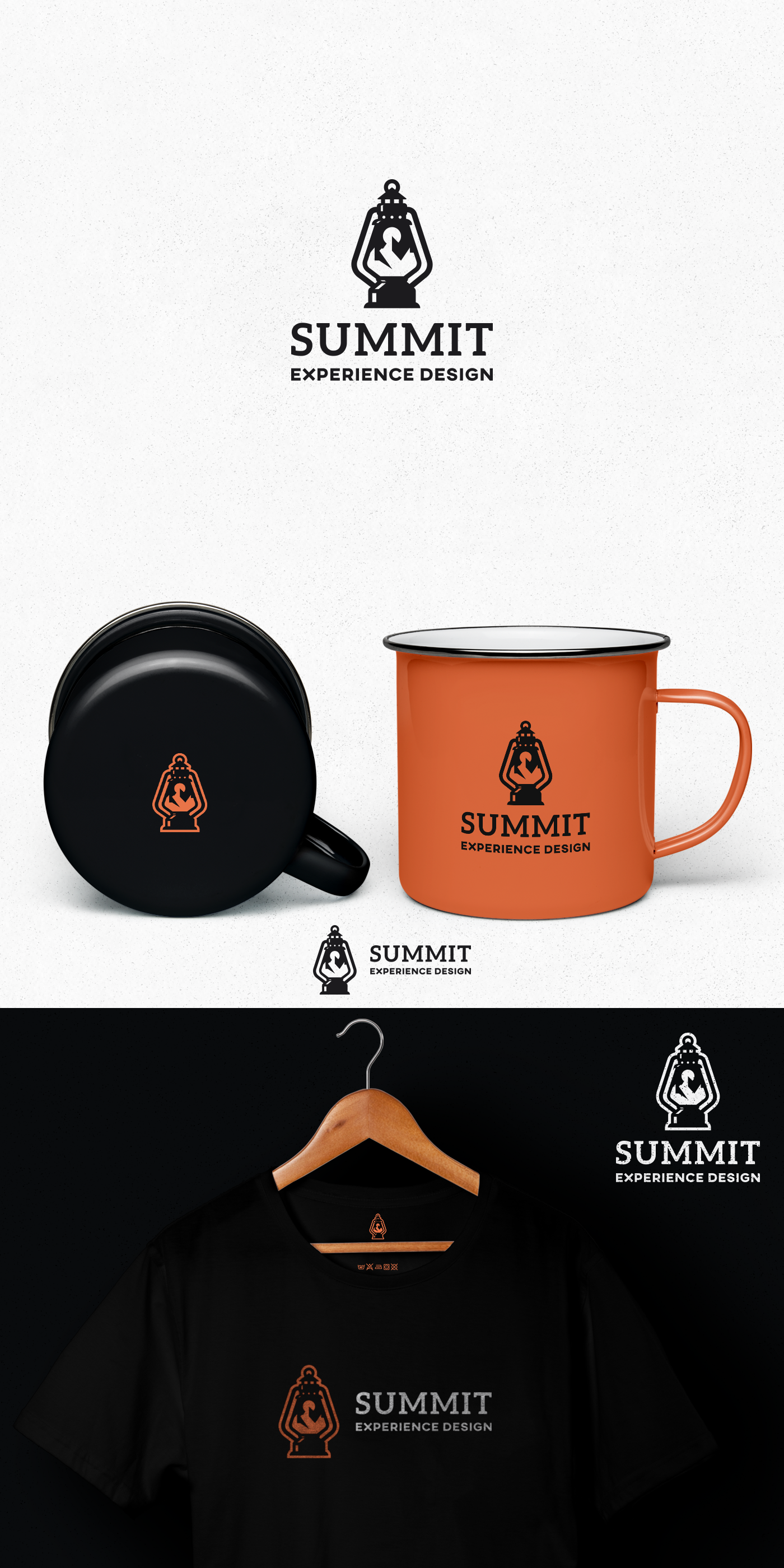
Logo for Summit the outdoor-loving UI/UX/dev shop

43
Creati su 99designs di Vista
A clean, and simple combination of mountains and old lantern with the use of negative space.
The idea of the use of lantern as the main shape of the logo is because it has been used by the hikers to light the path, and with this, I wanted to symbolize the UX part of the company business. Because without good user experience and prototyping users cannot find their path (flow) on a website or app and other products.