Bold concept for Hattaco clothing

4
Creati su 99designs di Vista
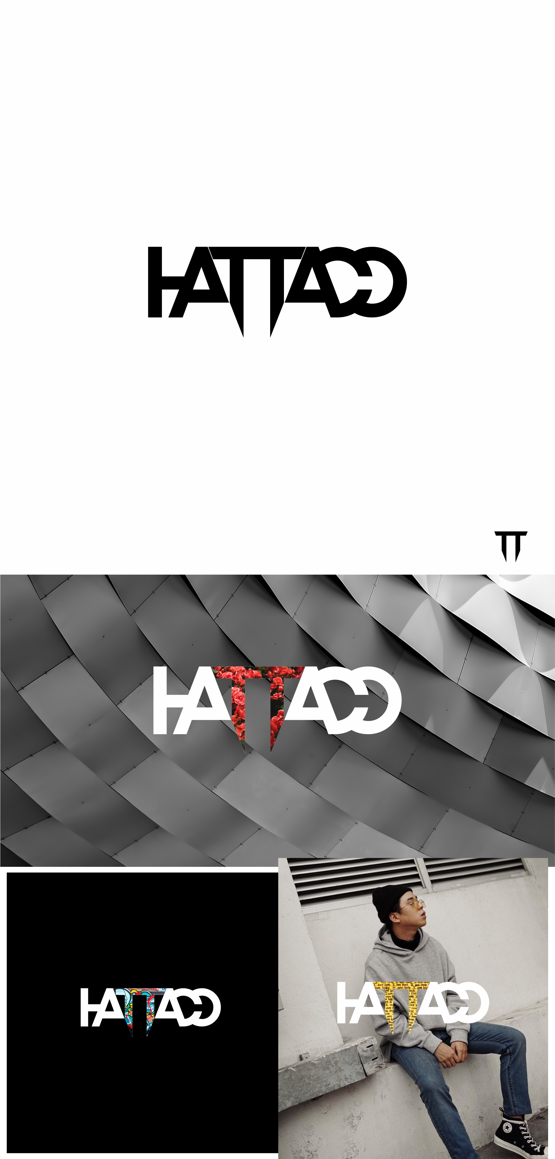
i do adaptation on the double TT and using emptiness to form the letters. you can read the letters even though it is actually not complete, one other is deleting the other. this makes the logo unique and memorable in its own way