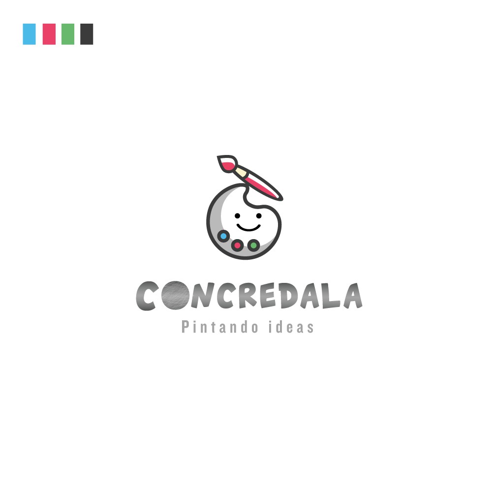
Logo concept for kids Art company

36
Creati su 99designs di Vista
It's is a company that sells concrete blocks to kids on which they do their painting. So overall I used the grey color for depicting concrete and made a simple color palette character Holding the paint brush. The O is visualized as round concrete shape to capture the overall theme of the company.