- Home
- Logo
- contest di Logo
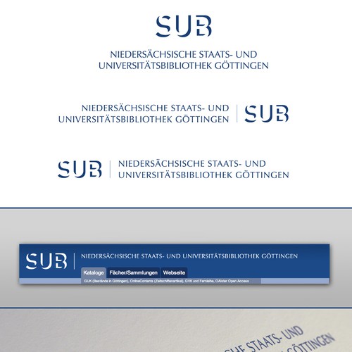
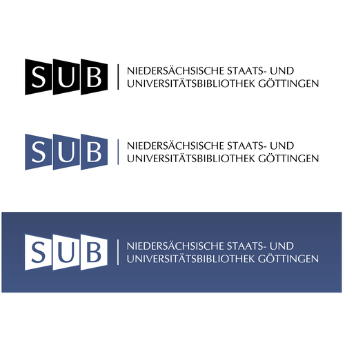
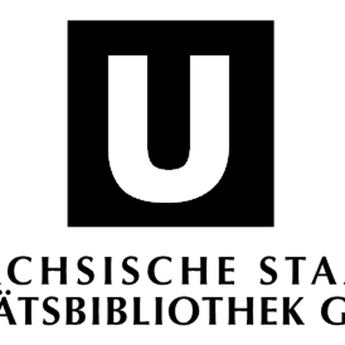
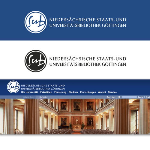
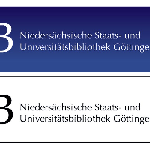
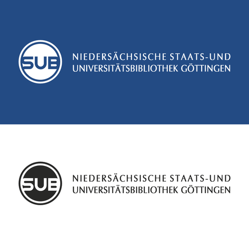
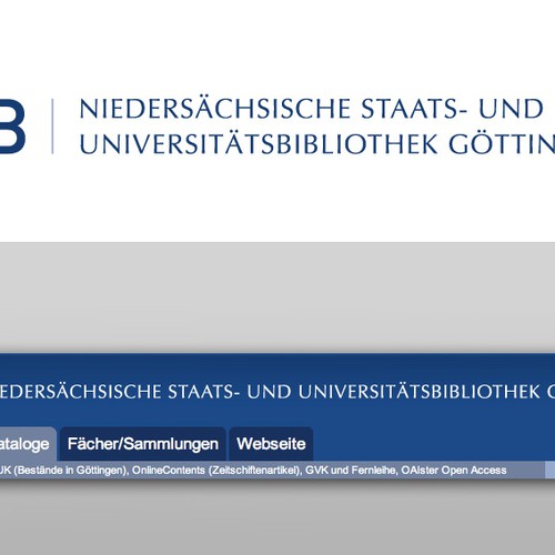
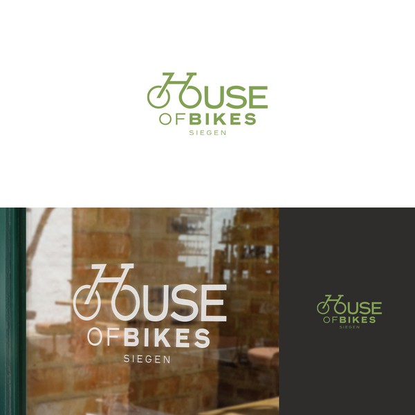
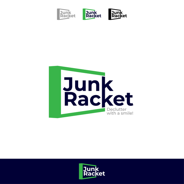
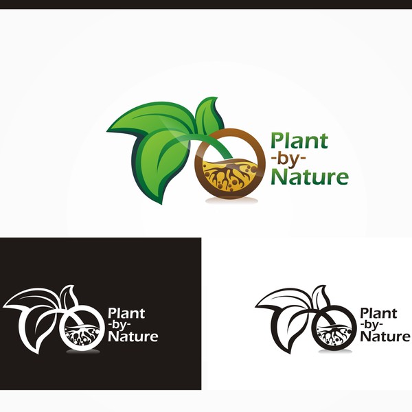
- Logo for Göttingen State and University Library
Ralf Stockmann ha ottenuto il suo nuovo design della categoria logo lanciando un contest:
 di MarcG
Logo for Göttingen State and University Library
Dai un'occhiata al contest di Ralf Stockmann nella categoria Logo
Tutto è iniziato con un brief di design.
Una breve guida interattiva ha aiutato il cliente a capire il suo stile di design e a descrivere esattamente le sue esigenze per la categoria logo.
Designer di tutto il mondo hanno presentato fantastici design.

proposte di design
Riceverai tantissime proposte di design da parte di designer esperti, provenienti da tutto il mondo.
designer
Collabora con designer professionisti e di talento della categoria Logo per trasformare le tue idee in realtà.
vincitore
Seleziona un design preferito della categoria Logo (o due! O tre!) E il design sarà tutto tuo.
Ralf Stockmann ha collaborato con i designer per perfezionare le sue idee
Valuta i design
Quando arriveranno le proposte di design, potrai valutarle, così i designer sapranno esattamente cosa stai cercando.
Dai un feedback
99designs ti offre ottimi strumenti di collaborazione per poter facilmente individuare e catturare le tue idee
E poi... ha scelto il vincitore!

Recensione del cliente
Perfekt, sehr zu empfehlen, kompetent und freundlich.
AnonimoLungo il percorso, ha incontrato tantissimi designer di talento...


Riteniamo che i contest siano un modo super divertente di ottenere un design.
Contest realizzati di recente:
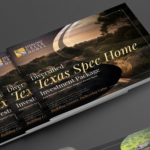
Luxury Real Estate Investment Brochure for Sterling Creek Homes’ Diversified Texas Spec Home Package
High-net-worth investors, private equity partners, and strategic capital groups interested in luxury residential real es
entries
designers
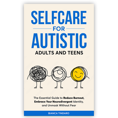
Selfcare for Autistic Adults and Teens
Autistic teens and adults (primarily 16–45), as well as parents, educators, and therapists who support neurodivergent pe
entries
designers
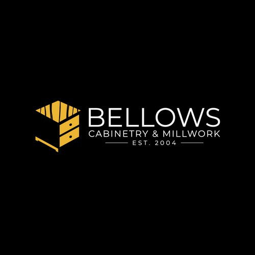
Cabinet Company needs new identity!
Custom Cabinetry, Millwork, residential and commercial
entries
designers
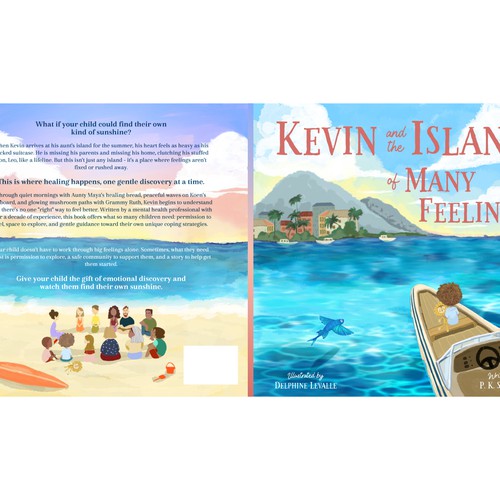
Book Cover design for a Calming, Heartfelt Children’s Story.
Parents and early readers ages 5-9 years old
entries
designers
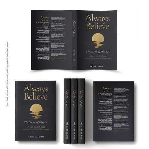
Poetic & Minimal Book Cover about Trust, Stillness, and Inner Wonder — for mindful young readers.
This book is for those who seek inner peace, meaning, and trust in a noisy world – for young adults (16+) and all who un
entries
designers
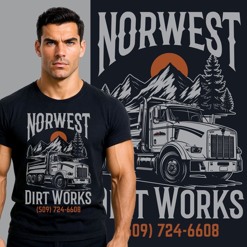
Attention Grabbing Excavation clothing design for growing business
hoodies and T-shirts I can sell to customers to help advertise my business. Needs to be something people want to buy and
entries
designers
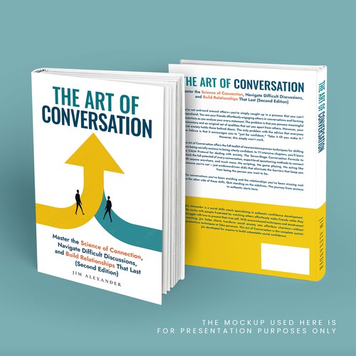
Modern, sophisticated cover for 'The Art of Conversation' - personal development for genuine connect
Men ages 18-35 struggling with social anxiety, shyness, or feeling socially "stuck"; Anyone regardless of gender who wan
entries
designers
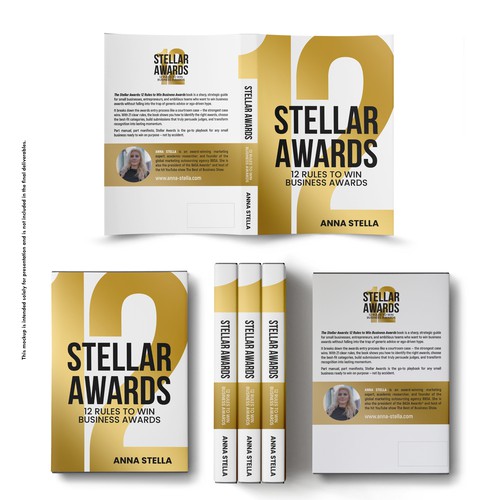
Stellar Awards: 12 Rules to Win Business Awards
Entrepreneurs. Mainly small business owners. 60% male, 40% women. Audience: English-speaking countries. They usually hol
entries
designers
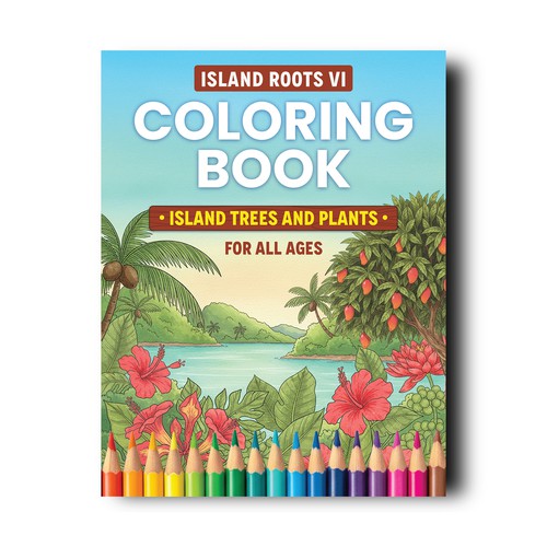
Caribbean Coloring Book Cover design to appeal to all ages
The target audience is for all ages and gender.
entries
designers
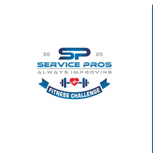
Company Logo - Fall Fitness Challenge
We install flooring (carpet, laminate, tile, hardwood) in residential homes in the United States
entries
designers

Make waves with my sophisticated "G"
General dermatology, surgery and aesthetic care targeting all ages and genders.
entries
designers
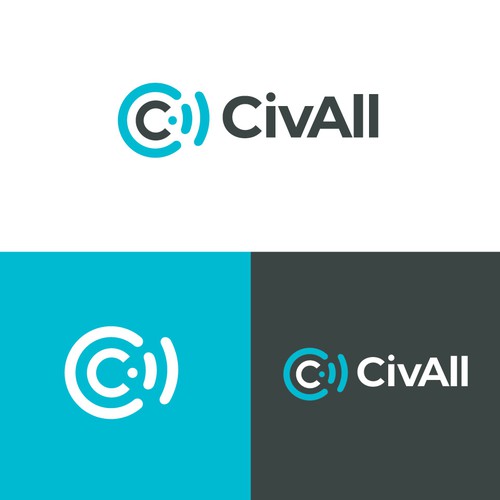
CivAll, SaaS Civic Engagement Logo Design
SaaS Civic Engagement Platform, CMS, social media management and communications tools for local governments.
entries
designers
Scopri altre idee di logo
 di bo_rad
 di pecas™ Carola Beker
 di Asaad™
 di 3AM3I
 di -Alya-
 di artsigma
 di Bion
 di artsigma
 di Hugo Maja
 di spARTan